 |
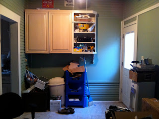
| Dark green - - - too dark for our things! |
 |
| Nice new cream.... makes the room seem lighter |
 |
| too dark |
 |
| light and ope |
 |
| Dark red and a light pink on the ceiling.... too much |
 |
| Light grey... looks blue, but its grey |
 |
| Master bedroom... Fathers Day |
 |
| Light Blue... and we painted the ceiling... not sure we like it |
 |
| other side of the master |
 |
| No pantry store... |
 |
| Really, no where to out my cans of soup! |
 |
| Welcome to the land of IKEA! |
 |
| Its a process... getting everything put in its place. |

4 comments:
Love the pictures!! Especially the last one with Claire in it.
I think I might only ever have a house like this in my dreams. It is beautiful. Great remodeling job. You all have nice taste, LOVE it!
It looks beautiful, I especially love the grey!
I LOVE home remodels! So jealous that we dont have the time or energy (or need) to do anything to ours. Keep posting!!! - Andi
Post a Comment